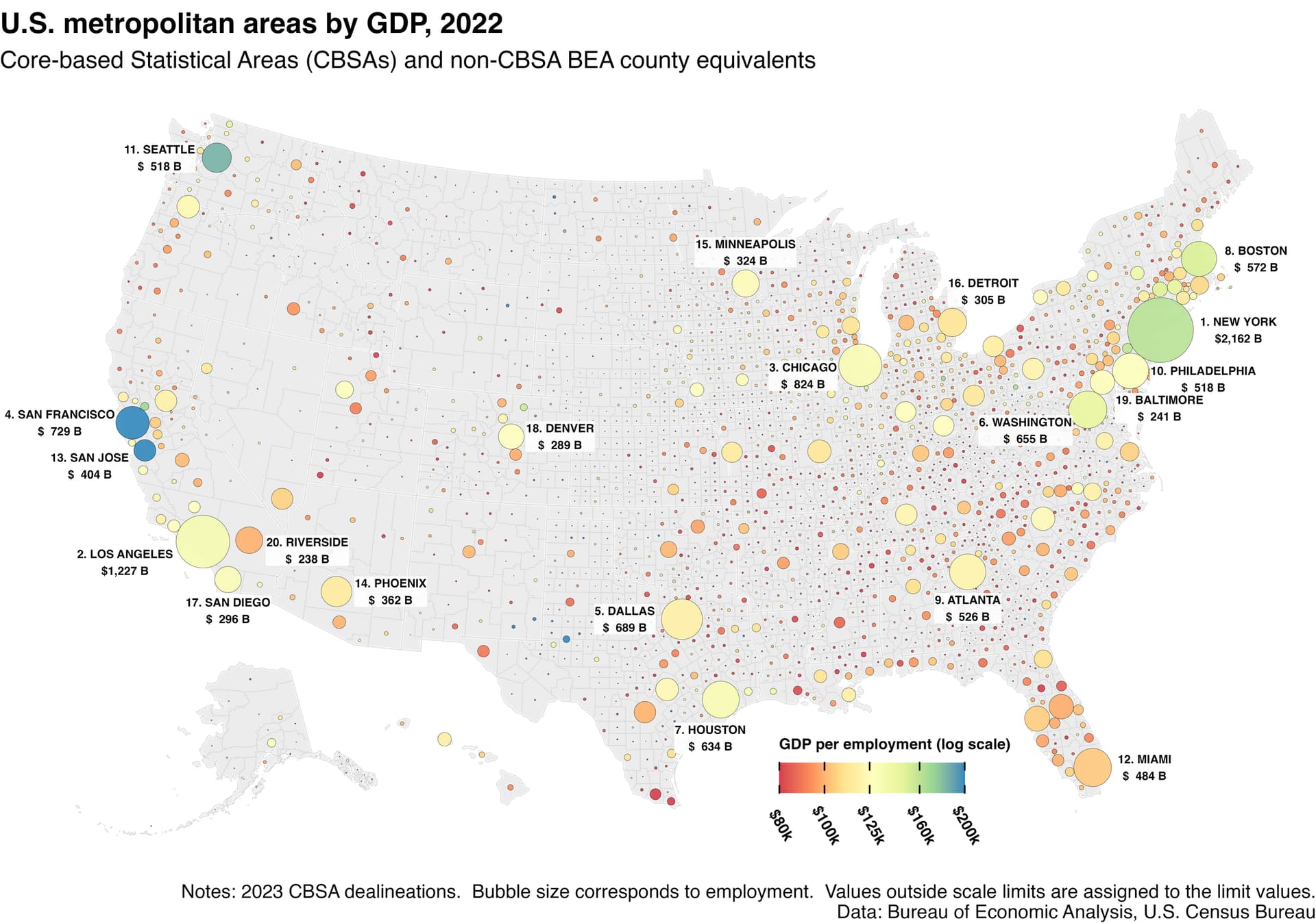
the size of bubble corresponds to size of work force
and color corresponds to GDP per capita
it’s kind of crazy how high GDP per capita is in Silicon Valley …