so this is not meant to be definitive. some corners were cut in the calculations mainly because i was too lazy to enter all the data by hand so i skipped some. but also because different tables use different boundaries for different metros etc.
never the less i think results below are close enough to accurate to give you general perspective.
for GDP i used the following table of GDP per capita from wikipedia:
the shocker of course is “Midland, Texas” being the richest place in USA. i bet 9 out of 10 people ( myself included ) never heard of that shithole. but apparently they make serious OIL money there.
and for population i used a spreadsheet downloaded from this page:
specifically i used this file:
https://www2.census.gov/programs-surveys/popest/tables/2020-2023/metro/totals/csa-est2023-pop.xlsx
what is great is it shows population from 2020 ( hard census data ) and estimates for 2020, 2021, 2022 and 2023 which allows me to make some projections for the future …
note the Wikipedia data is for MSA ( Metropolitan Statistical Area ) while Census data is for CSA ( combined statistical area ). this is an example of this being less than 100% rigorous analysis but but i feel it is the right way to do it for the purposes at hand …
that is i feel CSA is more relevant but it’s easier to find data for MSA so mixing and matching here i think is good compromise ( i use CSA population and MSA GDP per Capita )
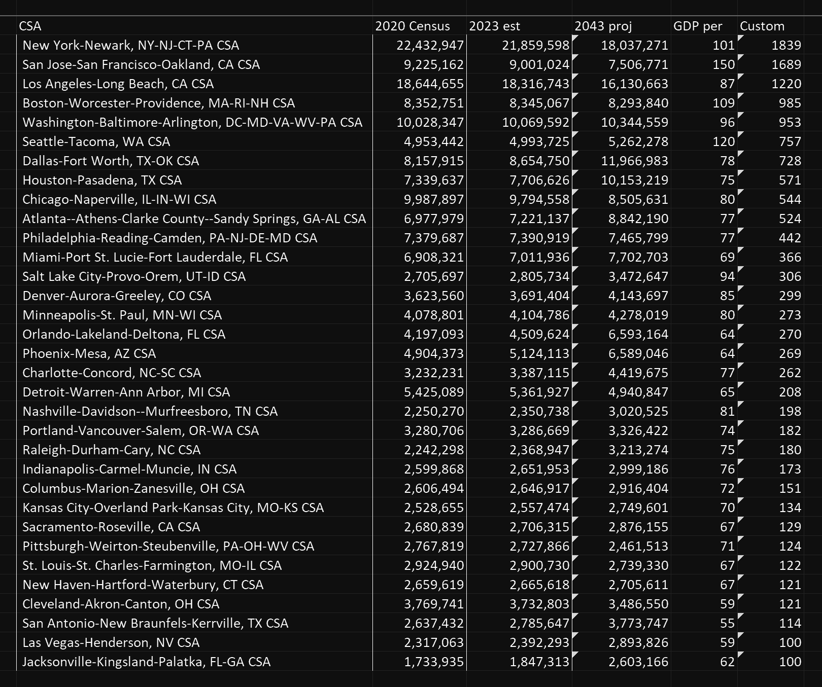
from the above i created the following table ( data from Excel, color from Photoshop ):
( click the table below to enlarge )
the table above is the final result and it shows metro areas already sorted in the order of awesomeness represented by “custom” parameter.
i wanted NYC to lose badly because i am here and i want to leave and need an excuse for it, but despite my best efforts NYC still won.
next i will explain what formulas i used.
to make the projection for 2043 population size ( basically 20 years from now ) i used the data from 2023 and 2020 to calculate annual growth and then multiplied that by 20 years. this is of course very crude, but for what i am trying to achieve here it’s good enough.
yes i know these are pandemic years, more on that later.
actual formula used was: =((20/3)*(S6-R6))+S6 where S, R and 6 refer to columns and rows in that excel spreadsheet i linked previously …
the second step was to sort the list based on projected 2043 population ( original list is in alphabetic order ). i only wanted my table to be about 30 rows and the original list was 180 rows so i had to sort it before trimming off the fat on the bottom of the list ( small metro areas )
then i manually entered GPD per capita for the remaining 30 rows from the wikipedia page.
next i used a custom formula to calculate Dissident Sound Desirability Index ( Custom )
the formula for that is: =INT((H6H6G6)/100000000)
H column here is my manually entered GDP per capita
G column here is the 2043 population projection
int returns an integer ( for a cleaner looking result ) and /100000000 makes the output value smaller, also for a cleaner looking result.
basically i am multiplying population by GDP per capita but with a twist …
if i simply multiplied population by GDP per capita i would get GDP which you can find already anywhere on the internet … the twist is my population is the 2043 projection and i am multiplying by the GDP per capita twice
the reason i multiply by GDP per capita twice is because this is the crucial data. this is what separates the high-end areas like San Francisco from bottom of the barrel ones like San Antonio
the end output ( “Custom” in the table ) is the calculated desirability of an area to move to based on GDP of the area, GDP per capita and population growth.
and the final step is to sort the list again, this time based on the “Custom” column.
and the reason i trust my formula is right is because the results look like what you would expect.
NYC in 1st place, Bay Area in 2nd, LA in 3rd, then Boston, DC, Seattle, DFW and Houston
this just looks very right to me …
i will point out a few glitches in the table that i noticed:
1 - there is no Tampa anywhere, even though it is very similar city to Orlando. i couldn’t even find Tampa in the base Excel sheet with 180 rows.
2 - there is no Austin. couldn’t find it in the base Excel spreadsheet.
3 - highest GDP per capital is Midland, TX but i avoided it because it is both small and i doubt anybody here is interested in working in the Oil industry.
there may be other glitches, but overall the output of the table seems legit.
also the change in population from 2020 to 2023 obviously was mostly pandemic related effects and yet i believe that pandemic simply made people move to where they were already planning to move in the first place.
most new Yorkers know it is their destiny to move to Florida but it was during the pandemic when they finally packed their bags and left.
same with Californians leaving for Texas.
in the end the table is meant to show which metro areas are the largest, most affluent and fastest growing all in one list.
NYC is of course fast declining - but it is SO huge that even after 20 years of decline it will still be number one. this is the kind of insight that you can only get by crunching the numbers, which is what my table does for you.
many pages list various data but none of them can put it all together the way only a super genius can.
of course this isn’t even close to all the data. i am separately working on climate data. and this doesn’t address demographics either.
what i discovered when researching this subject ( where to move to ) is the more you know the more all the information becomes overwhelming.
i found it impossible to think of all the factors involved at the same time so i started developing these mathematical tools to consolidate some of the factors together so that i would have less information to process manually using DA BRAIN.
this particular table consolidates 3 factors ( population, growth rate and GDP per capita ) into one parameter ( “Custom” ).
i have likewise developed another method that consolidates climate data into one parameter, that will be subject of future article. confusingly it also will be called ( “Custom” ). LOL
bestplaces.net has a “comfort index” for every city in USA which is helpful, but focuses on how it FEELS to be outside. my climate index will focus on HVAC COSTS instead.
the final decision is always made by gut feeling but all the information must be researched and all the numbers crunched before you ultimately just do whatever the fuck you want.
that’s my ideology.