https://bestneighborhood.org
amazing interactive maps showing race, property values, average education level and so on …
in real estate it’s Location, Location, Location …
this is the first map you should look at but it shouldn’t be the only one.
you should also check for things like flood risk, population TRENDS and so on …
Real Estate websites like RedFin may have flood risk maps or other tools built in, but those tend to be relatively rudimentary …
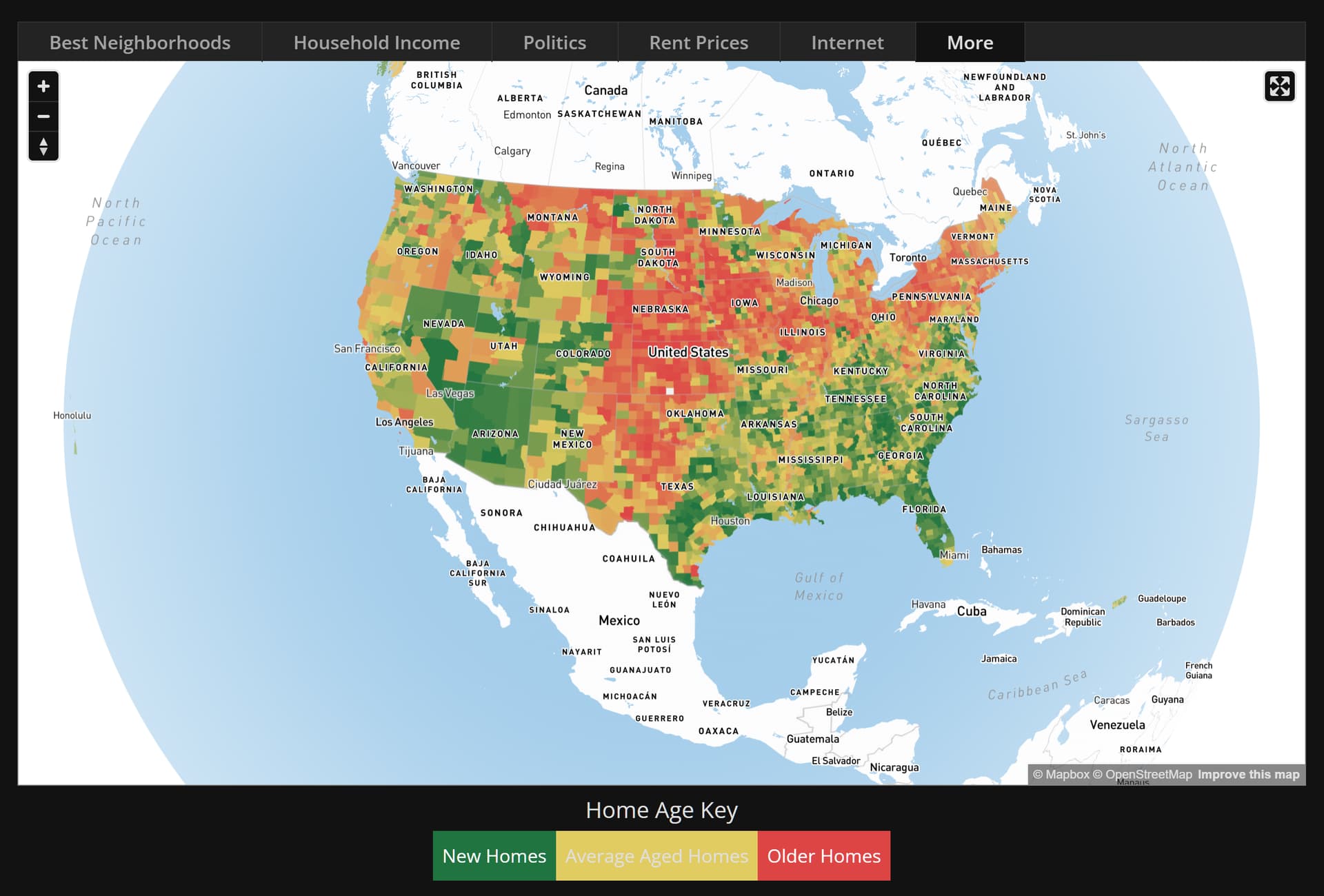
BestNeighborhood now shows maps as an accurate 3D globe that can be rotated:
even though it only has data for US i appreciate that proportions aren’t getting distorted as they would be in a flat map.
for those not in the know on a regular flat projection map the shortest distance between two points is NOT a straight line unless the two points share either latitude or longitude.
but on a 3D globe everything is as you would expect, because it is true to the actual shape of the earth surface.
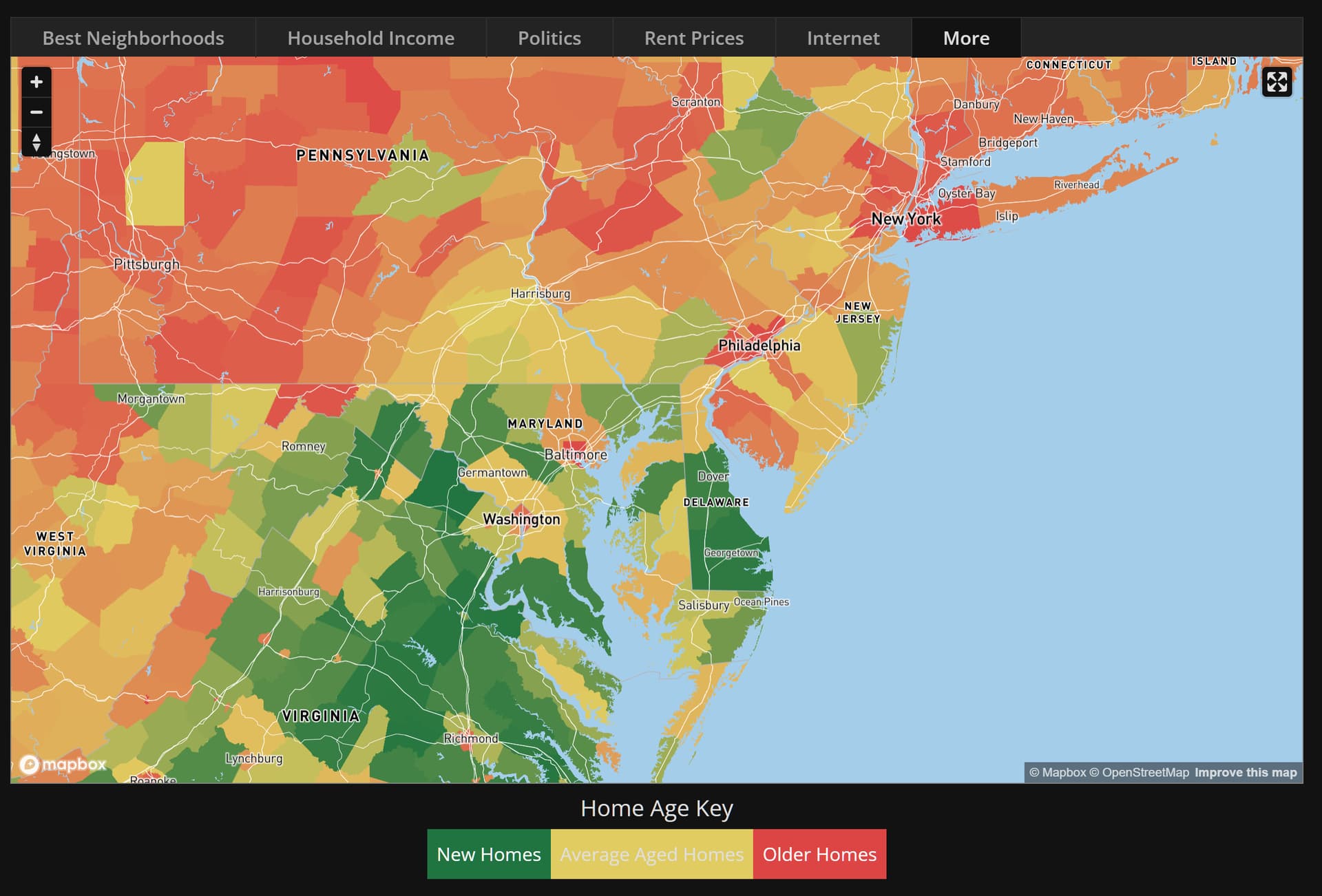
anyway referring to the above map you can see which parts of America are dying ( in red ) based on average home age.
if average home age is high it means few new homes are being built in the area.
and vice versa green areas are the ones with a lot of new construction - the areas that are currently booming or at least underwent a boom in the last 20 years or so.
as you can see NYC is dying: